PELOTON ANALYSIS
During the earlier days of the pandemic, circa late 2020, I was desperate to get back into my active lifestyle. I had canceled my gym memberships (most places were shutting down) and lost all motivation to adapt my fitness routine. After months of succumbing to an inactive slump, I decided to get back into the swing of working out. Which prompted me to download the Peloton app (what was all the fuss about Peloton anyways?). In no time, I fell in love with their classes and instructors. I was officially back and Peloton was holding me accountable!
Fast forward to today, it’s been nearly two years and I’m still going strong. I’m now a proud owner of the Peloton Bike, and I ride at least 100 miles a month. Part of what makes Peloton so sticky is the visibility of one’s workout metrics - # classes, hours, calories. Which got me thinking - why not use my own data to do something cool?
DATA COLLECTION
My first question was “how can I get my Peloton data?” After some Googling I noticed Peloton has their own API that lets users tap into their own personal workout data (authentication only requires a Peloton username and password). And to my delight, I also found out someone had developed an API wrapper in R to make the wrangling process 10x easier! Special thank you to Laura Ellis, genius creator of pelotonR - this package did a lot of the heavy lifting!
VISUALIZATIONS
Peloton Instructor Summary
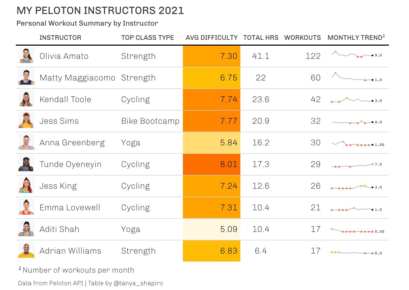
For my end of 2021 workout analysis, I was also curious to see a breakdown by instructors: who did I spend the most time with? who was the toughest? what type of classes did we do together? To answer these questions, I knew a table would be best to show all the relevant pieces of information. Using R and gT tables and gtExtra, I made the following visual. Not surprised to see Olivia Amato at the top - she kills me on the bike and I love her core classes!
Active Days Calendar
The Peloton App keeps users highly engaged with visuals like the active days calendar - which displays the last 30 days and highlights each day at least one class was taken. At the end of 2021, I was inspired to do a review of my own workouts and put my own spin on the active days calendar. Using R ggplot, I created a visual showing the entire calendar year, and used different colors to denote the type or types of workouts taken on each active day.
On Your Mark, Get Set - Go!
My partner noticed a moving bar chart video, or what’s also known as a “racing bar chart”, on TikTok. She asked me if it was possible to do something using R. I was up for the challenge! Fortunately, with R packages like gganimate, this task was easy. I used my Peloton workout history data to show cumulative hours per instructor by month. Visualization exported in GIF format.
Do I Have a Favorite Instructor?
The animated racing bar chart was a cool way to visualize most time spent per instructor over time. I wanted to also produce a static visual that could convey the same message - who was I spending the most amount of time with and did my preferences change over time? I used ggplot and ggbump to analyze my instructor rankings over time. While Olivia Amato remains a staple in my Peloton routine, it’s hard not to notice Kendall rising to the top as one of my leading favorites.
Pedal To The Metal!
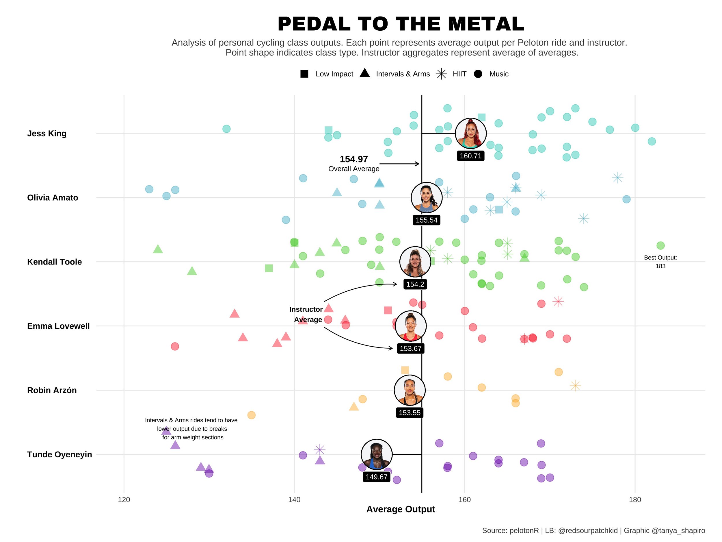
Inspired by Cédric Scherer's lollipop-jitter plot, I wanted to visualize my Peloton cycling metrics by instructor - am I pushing myself harder with a particular trainer? I used point shapes to indicate different class types. Important to note that class type can influence output: for instance, "Low Impact" classes call for less resistance (yielding less output) and "Intervals & Arms" classes have deliberate cycling breaks to focus on arm weight sections. Plot created with R ggplot and ggimage.
Toughest Instructors
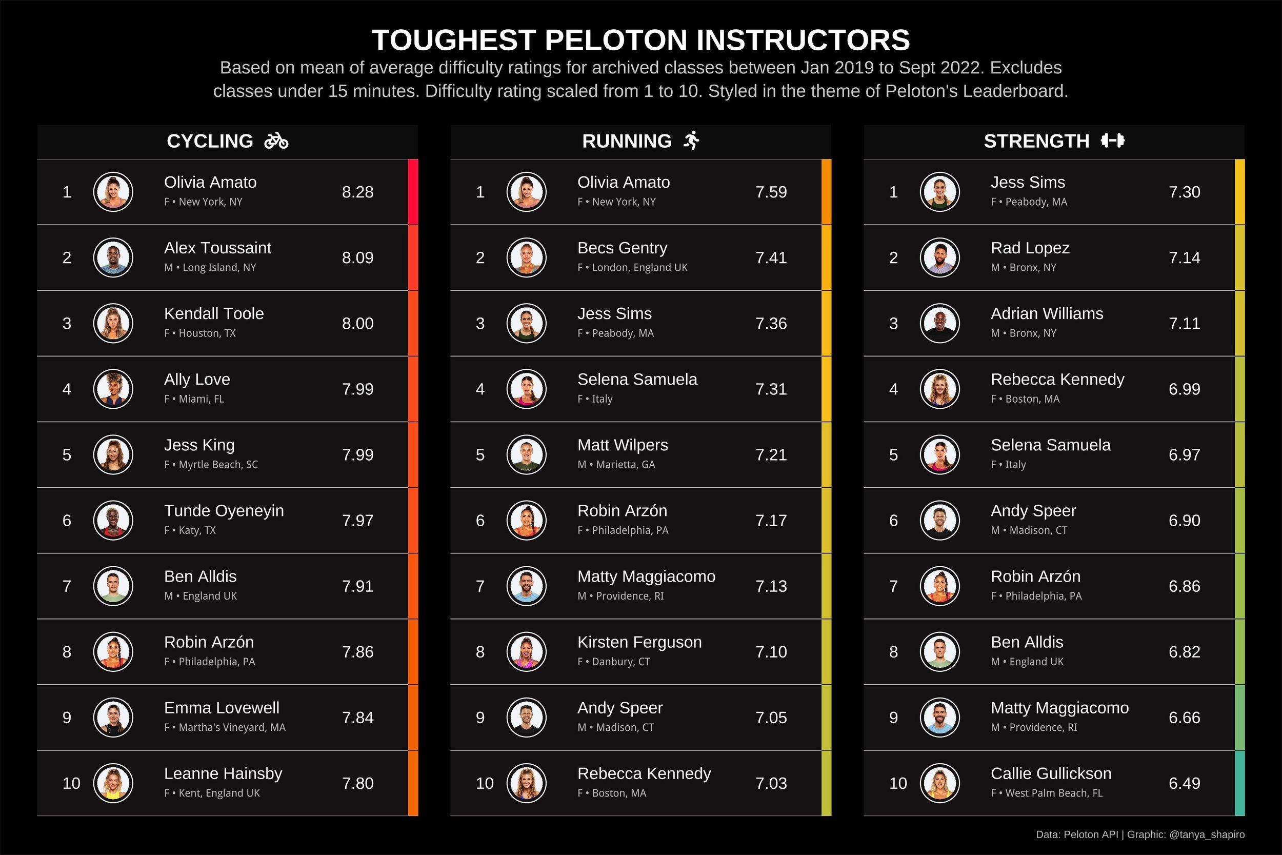
My goal for this visual was to recreate the style and feel of Peloton’s user leaderboard to explore toughest instructors by fitness discipline. The leaderboard uses an average of all difficulty ratings per class (an average score based on user feedback). The rankings use archived classes from January 2019 to September 2022. I added in supplementary information about the instructors, i.e. hometown, from Google search.
Developing My Shiny App
As my obsession with analyzing Peloton data evolved, I wanted to take things to the next level. I had more questions that couldn’t be satisfied by one graphic or table alone. I constantly wanted to change the date ranges and filter to see my data by different class types. To satiate my curiosity, I set forth on building my own application using R Shiny. The Shiny application has different inputs that interact with reactable summarizing workouts and metrics by instructors.


